Barchart Solutions Website Redesign
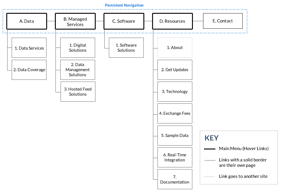
The redesign consisted of updating the branding look and feel as well as consolidating content to make it easier for the user to find what they are looking for. The examples below show the previous menu at the top of the page with the corresponding sitemap below it as well as the updated sitemap from the current site.
Problem: Each dropdown menu had a lot of links forcing the user to take more time to find what they're looking for and making it more difficult to memorize where things are located. On top of that the navigation patterns were inconsistent. Many of the links used in different sections of the dropdowns went to the same page even though the appearance made it seem like separate pages were listed.
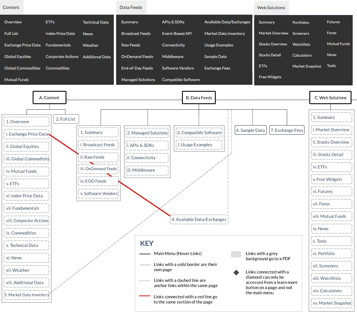
Before (Part A)
Before (Part B)
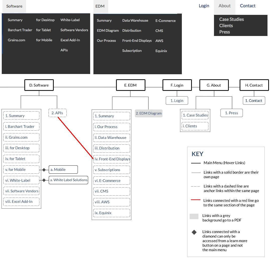
Solution: Keeping in-page links (hypertext links) only accessible from the page that they live on eliminated many of the links and forces the user to search through the links by high level topics.
After